How to Make Your Launch Tweet Stand Out on X in 2026
A practical breakdown of what makes people stop scrolling for a launch tweet: motion, framing, one clear annotation, and posting the output instead of the tool.
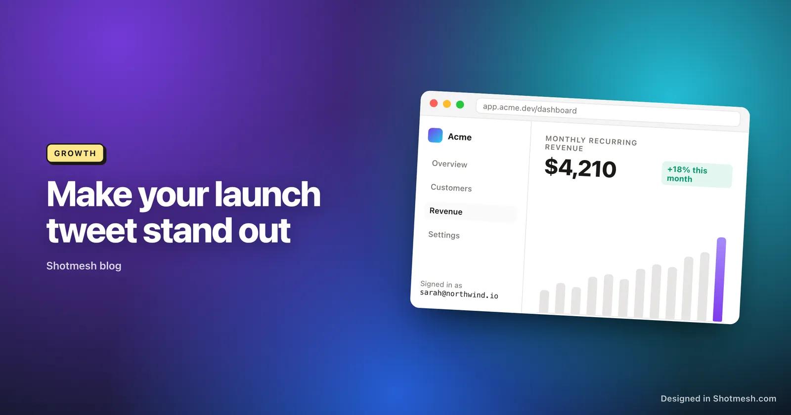
Most launch tweets die in the first half second, before anyone reads a word of the copy. People are scrolling fast, and their thumb only stops for something that looks different from the wall of text and stock screenshots around it. If your tweet looks like everyone else's plain screenshot, it gets the same fate: a glance and a swipe past.
We built Shotmesh because we kept seeing the same mistake in our own launches: spending three weeks on the product and three minutes on the screenshot that was supposed to sell it. This post is what we've learned about what actually makes people stop, read, and click through on a launch tweet in 2026.
What people actually stop for
Nobody stops scrolling because your headline is clever. They stop because something in the visual field moves, or looks unusually clean, or shows a result they want for themselves. A launch tweet has about one second to earn a second look, and that decision happens entirely on the visual, before the caption is read.
The three things that reliably earn that second look are motion, a recognizable before/after or result, and framing that doesn't look like a random screen grab. None of these require design skill. They require you to stop pasting a raw screenshot into the tweet composer and instead spend two minutes making it look intentional.
Use motion, because the numbers are not close
This is the part most indie hackers skip because a GIF or video feels like extra work. It isn't, and the data says it's the highest leverage two minutes you can spend on a launch post. Twitter's own marketing research found that tweets with a GIF got 55% more engagement than tweets without one. The gap between formats is even wider than that single stat suggests.
According to the same research, tweets with a static image get roughly 3x the engagement of text-only tweets, GIFs get roughly 6x, and video gets roughly 9x. That's not a small optimization, that's the difference between a tweet that gets buried and one that gets seen. X also autoplays both GIFs and videos directly in the timeline by default, so the motion is working before anyone even taps on your tweet.
- If you only have a static screenshot, a 3 to 5 second looping export of one interaction beats it on engagement almost every time.
- Record the smallest useful action, a button click, a chart animating in, a before/after toggle, not a full walkthrough.
- Export as MP4 when you can, it's sharper and has no 15MB size ceiling to fight against.
Frame the screenshot like it's a photo, not a crop
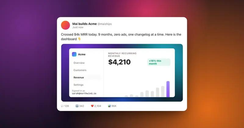
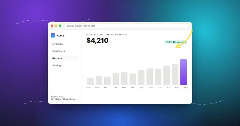
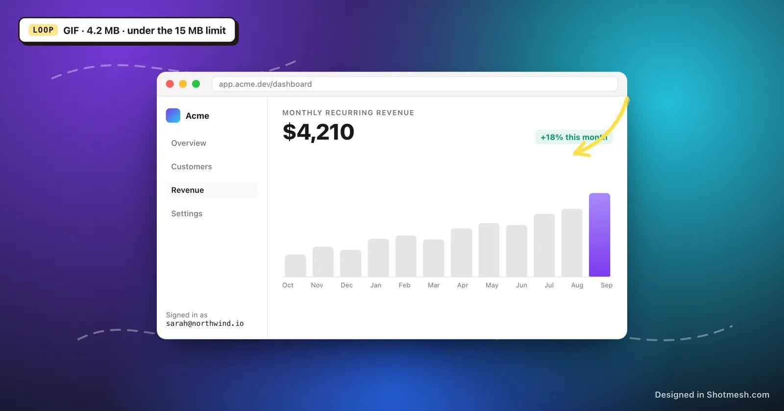
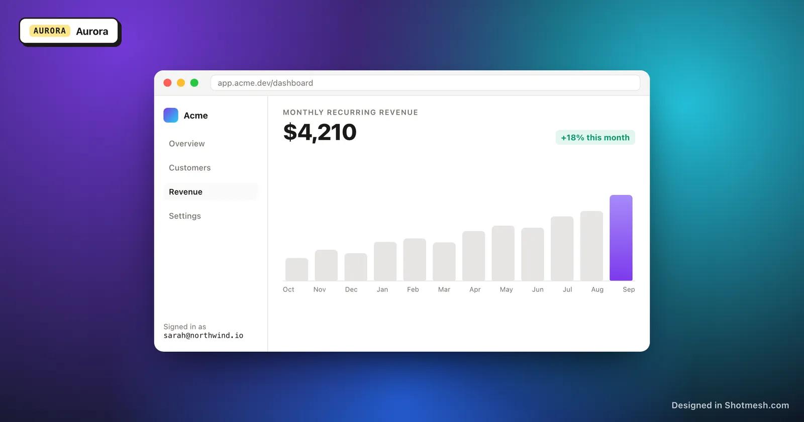
A raw screenshot pasted straight from your OS has a flat, unframed look that reads as unfinished. Adding a browser chrome frame, a macOS window frame, or a device mockup (MacBook, iPhone, iPad) does two things at once: it gives the eye an edge to land on, and it signals this is a real, shipped product rather than a work in progress.
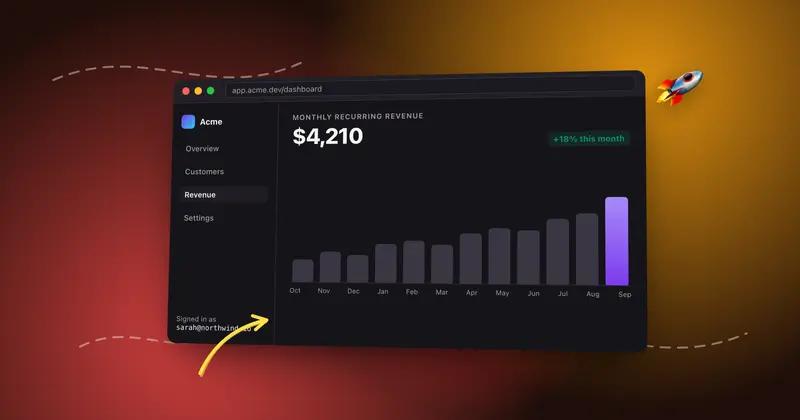
Background matters more than people expect. A plain white or default gray background blends into the timeline's own background and gives your tweet no visual weight. A gradient or subtle scene behind the frame gives the screenshot contrast against the feed, which is most of what makes it stop a thumb.
Keep the gradient calm. The goal is contrast for the frame, not a background that competes with your product for attention. Muted gradients or a soft mesh work better than anything loud or saturated.
- Use a browser frame for web apps, a macOS window frame for desktop tools, a phone mockup for mobile screens.
- Add a subtle gradient background, not a busy pattern, so the product stays the visual focus.
- A slight 3D tilt on the frame can add depth without making the screenshot harder to read.
One annotation, not five
It's tempting to circle everything you're proud of, but a screenshot with five arrows and three highlights reads as noise, not signal. Pick the single most important thing in the frame, the number that went up, the button that does the magic, the diff that shrank, and point at only that.
An arrow or underline drawn by hand looks more human and more trustworthy than a rectangle dropped by design software. It also draws the eye faster, because it mimics the way a person would actually point something out to a friend.
Make sure it's readable on a phone
The majority of impressions on your launch tweet will come from a phone screen roughly 3 to 4 inches wide, in a timeline where your image is compressed further. Text that looks fine on your 27 inch monitor can be completely unreadable at that size. Zoom your final export out to roughly the size it'll render in a timeline and check if you can still read the key text.
If your product has small UI text, don't just screenshot the whole app. Crop tighter around the part that matters, or increase the zoom level in your app before capturing, so the important text survives the shrink down to mobile size.
Post the output, not the tool
One of the most consistent growth patterns among indie tools is that people ask what made a good screenshot or recording before they ask what the underlying product does. Screen Studio, a Mac screen recorder, grew to 8,000 customers in 9 months largely because people who saw its polished output in other people's tweets asked what tool made it. The output became the marketing.
This works both ways for you. When you post a clean, framed, animated screenshot of your own product, some of those replies won't be about your product at all, they'll be 'what did you use to make this look this good.' That's a second growth loop stacked on top of your launch, and it's free.
Turn your next screenshot into a launch-ready tweet in your browser, no signup.